
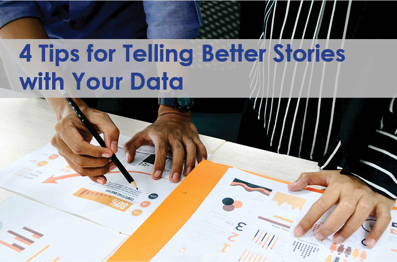
As challenging times continue for higher education, data literacy and data-informed decision-making are even more important for student and institutional success. We have a lot of data, yet well-designed data presentations that foster effective decision-making are few and far between. Sometimes our data presentations are successful and result in new funding or IT project support. Other times, decision-makers acknowledge the data presented, but support isn’t garnered, and a decision isn’t made.
How do you move from simply sharing data to connecting with your audience in a meaningful way? Maybe data literacy is more than just understanding or communicating the meaning of data. In this blog, we’ll cover four steps you can take to prepare a presentation in which the data are strong, well-organized, and compelling—and much more likely to lead to successful decision-making.
Data Alone Are Not Enough
Most institutions have hundreds or thousands of readily available operational reports. Many have access to excellent data query tools so employees across campus can create ad hoc queries and reports. If we have enough data, understand the data, and are skilled at creating reports and presentations to effectively communicate, what is missing in the data-informed decision-making process?
Gartner defines data literacy as “the ability to read, write and communicate data in context, with an understanding of the data sources and constructs, analytical methods and techniques applied, and the ability to describe the use case application and resulting business value or outcome.” Sometimes communication of the “use case application” and “business value or outcome” is where many of us fall short.
To address that shortfall, it’s helpful to understand the basics of how our brains make decisions. In Start with Why, Simon Sinek describes how our brain’s powerful low-level or limbic system is directly responsible for our decision-making processes. The problem is the limbic system is feelings-based and not capable of processing language or numbers or charts or graphs, or any data at all! Have you ever made a decision that was tough to explain to anybody, but it felt right? That is one example of your limbic brain in action. The higher-order part of your brain that evolved after the limbic system is called the neocortex. The neocortex does understand language and data, but there seems to be a firewall of sorts that blocks communication between those two sections of our brain. Have you ever said, “I just can’t put it into words,” or tried to describe why you love somebody? Maybe you ordered dinner at a restaurant and said, “that sounded good tonight.” These are examples of the limbic system making a decision and the neocortex struggling to explain why. This is a very brief and oversimplified description of how our brain makes decisions, but it can help us begin to understand why data alone do not always result in a data-informed decision.
If we acknowledge that data alone, even if well understood, aren’t enough to help people make a decision, or result in a business value or outcome (as Gartner defined data literacy), what strategies or approaches can we use to help consumers of data make informed decisions? Since most reports written for decision-makers are presented by a person using some type of presentation medium, we’ll focus on tangible steps we can take to better communicate with data.
Start with a Story
Instead of starting to build a presentation by opening your favorite presentation software and diving right into creating slides or visuals, take time to think about the story you are telling. Ask yourself why you are presenting, what you hope to accomplish, and why this topic matters to the audience. You might have to ask yourself these questions more than once to get to the core reasons. There is a lot of research about storytelling and how we evolved to engage with stories. Unlike data or bullet points on a slide, a story will light up a person’s limbic system and elicit an emotional response. A good story will release oxytocin in those who are listening, and trust will build between you and your audience. Once you have told a good story and developed trust, you can use the data to tie rational thought to emotional response.
Example: Share The Compelling “Why” Behind Your Wi-Fi Upgrade
The Crisis: WiFi is Failing
Let’s imagine your college or university needs a campus Wi-Fi upgrade. The existing 802.11n infrastructure was installed years ago and only a few upgraded wireless access points (WAPs) support 802.11ac standards. In addition, the WAPs are hardwired with 100 Mbps connections and don’t support newer MU-MIMO or beamforming features for faster throughput and extended range. Your department spends a lot of time troubleshooting Wi-Fi issues and some of the older access points are failing, sometimes at night requiring off-hours support. Your networking employees are not happy, and the helpdesk is reporting many student complaints about the slow speeds and lack of coverage. They are also hearing from faculty about the lack of Wi-Fi in classrooms as newer-adopted pedagogy is now relying more on the students’ own technology for instruction. And, these complaints have only increased in the past couple of years as the pandemic drove students to find more socially distant places to study and connect their devices. Since the existing Wi-Fi infrastructure was installed using one-time funding, there isn’t any recurring budget to address the issue. You need to do something to address the crisis.
The Story: Better Wi-Fi Supports Student Success
You decide to make a presentation to campus leadership with the goal of receiving funding to refresh Wi-Fi technology and expand coverage. Knowing most decision-makers will not be swayed by statistics about the number of access points, lacking bandwidth, age of the equipment, old slow Wi-Fi standards, failure rates, overtime costs in the IT budget, limited network backhaul channels, lack of coverage, or new technology improvements, you decide a story about “why” you need to upgrade the Wi-Fi infrastructure will be more compelling. Realizing the complaints lodged by students are an excellent place to start, you reach out to a few specific students from your ticketing system. One of those students talked to you about the struggles of trying to get their degree while also being a single mother and working a full-time job. Their home and work environments are not conducive to studying, so they typically grab time before or after class to study. They found a couple of remote quiet places on campus to study, but the Wi-Fi is poor in those areas, and the student is struggling to keep up with their school work. This student’s story shows your audience why better campus Wi-Fi will support student retention, something they care about. Once you and the audience are emotionally in sync, you can use data to engage their rational minds, illustrating what the project will require and how the investment will contribute toward your institution’s student success goals. I’ve used this approach, and it works!
Example: Show How Security and Privacy Investments Support the Student Experience
The Risk: The Seamless Digital Experience Students Expect May Leave Data Unsecured
It is a challenge for most colleges and universities to invest sufficiently in data privacy and cybersecurity. You might not need to imagine this is true at your institution as your efforts to convince the campus about the growing need seem to be ignored or dismissed. In recent years, the need to enhance data privacy and security has become even more important as departments across campus are implementing systems designed to improve the student experience. Every one of those new systems needs to be integrated into your IT infrastructure, and most will be housing some type of student data. All of this expansion of IT systems is increasing institutional data privacy and security risk.
The Story: Security and Privacy Investments Ensure Students Are Protected
To address the growing risk, many IT leaders start by talking to campus leadership about the growth of systems, integrations, personal information collected and stored, compliance, vulnerabilities, attack vectors, etc. Most campus leaders will agree that we need to protect student data, and many will assume that you are doing it already. Many won’t find your risk-focused presentation compelling. How can you advocate effectively for the security and privacy investments you need?
Instead of talking about technology risk management, start your presentation with the story of the human at the center. A typical incoming first-year student this fall was three years old when the iPhone launched; they know only a connected world. They are usually very comfortable sharing their data and trust your institution to keep it private. They will also tell you that dealing with data breaches can cause devastating impacts and stress for students who often have little room for things to go wrong with personal finances. Investments in security and privacy will ensure they get what they need, when they need it, and where they want it. Start your presentation with a story about one of these students. Talk about every technology touchpoint they encounter as they learn, work, and connect. When you shift your presentation to talking about security and privacy investments, your audience knows that the decisions they make will have an impact far beyond the IT organization. They will see the student at the center and understand why protecting their data and privacy is key to enabling the experience they expect and to supporting their retention and success.
Keep it Simple
As you prepare your presentation, remember that providing more data is not always the best approach. While not universal, most IT professionals like details, have access to lots of data, and usually track our departmental performance using metrics. As a result, we tend to write or present with an overwhelming amount of data. While we might be comfortable with this, it doesn’t work for most audiences. Their eyes glaze over and they stop listening. In “Ten simple rules for effective presentation slides,” Kristen M. Naegle provides tips for designing to avoid cognitive overload. The main point is to keep things simple by eliminating potential mental stumbling blocks for the audience. Don’t include text or graphs displaying too much information. Use high contrast colors and simple backgrounds with large fonts. Effective communication with data often falls into the “less is more” category. This is easy to write or say, but very difficult to pull off in practice. The urge to include one extra slide or essential data point is strong! As the presenter, you often can’t see the forest for the trees, and you may need outside help to identify the parts of your presentation that are too complex. Show your presentation to others and ask if it is too long or complicated. Be willing to take their advice, and remember that sometimes cutting is more important than including.
Remember that Visuals Matter
How you choose to display your data makes a big difference. Using the presentation software’s default charts, graphs, and tables won’t necessarily help you communicate effectively. During a presentation, we have all said or heard, “I know you can’t read this, but…” or “I am going to need to help you interpret this graph.” In both cases, there are issues with the core visuals. When designing a slide, focus on the one thing you want the audience to remember and create visuals that draw their eye to that element. People are good at noticing something that is different. Use that to your advantage by highlighting the key element using color or a box or font size. You should be able to show the slide for a few seconds and have your audience know what the main point was. Practice this with somebody, and you’ll quickly realize if your slide was constructed well or not. When presenting, be sure to provide verbal reinforcement of your key point; this helps reinforce your message via multiple sensory pathways and is also a practice that includes audience members who are blind or visually impaired.
Below is a before and after slide example that comes from an EDUCAUSE 2018 Annual Conference Workshop I was part of, “A Thousand Words and a Picture: Storytelling with Data.” We started with the default graphic created using the presentation software pie chart tool. In a matter of minutes, my co-presenter Juliana Kutch improved the graphic by changing the colors to be less distracting and adding the white circle at the center, simple but effective changes. The result is that the main point of the data we presented was much clearer to the audience.


Practice, Practice, Practice
Practice is key to good storytelling and presentations. Almost all of us have watched a TED talk and been impressed by the presentation. What we enjoyed was rehearsed over and over again, sometimes for months before the actual talk. Most of us will not be delivering TED talks and will not have the time to rehearse for three to six months, but we can set aside time to practice. Start out by yourself in a room and talk through your presentation like you are presenting. Stand if you will be standing and sit if you will be sitting. Pay attention to the time and make sure you are at least 10% below your allocated time limit. Many people find they run about 10% longer when they get in front of an audience. If your presentation is too long, cut more instead of talking faster. When you feel comfortable with your presentation and timing, practice in front of someone and ask for direct feedback. You can also record yourself with your phone. You might be surprised to learn how many times you say “ah” or fidget with your hands. In addition, you can also use feedback from an observer—or your recording of yourself—to identify content that detracts from your message rather than strengthening it. Because everyone is different, you need to practice in a way that is effective for you and set aside time in your schedule to make it a priority.
The steps outlined above are tangible ways you can improve your data literacy and be more effective when presenting with data. If you start with an emotional connection, tell the meaningful story behind your data, keep it simple, remember that visuals matter, and practice, you and your data will shine.
Resources
- Chris Anderson’s “Ted Talks: The Official TED Guide to Public Speaking” explores the power of rehearsing your presentation.
- The EDUCAUSE Presenter Concierge is a good resource for presentation design, delivery, and facilitation.
- Stephen Few’s “Now You See It: An Introduction to Visual Data Sensemaking” is an excellent resource for more on data visualization and storytelling.
- Federal Trade Commission’s Consumer Sentinel Network Data Book 2021 – Aggregate information from consumers on the full range of fraud, identity theft and other consumer protection topics.
- Kristen M. Naegle’s “Ten simple rules for effective presentation slides” explains how to use design to avoid cognitive overload.
- Richard Restak’s The Naked Brain is a good place to start for more on the neuroscience behind decision making.
- Simon Sinek’s Start with Why introduces you to the basics of how our brains make decisions.
- Edward Tufte’s books on data visualization are seminal in the field.
This post was authored by Vantage Vice President Kirk Kelly, who advises clients on data governance and analytics, strategic planning, organizational assessments and development, culture and engagement, and IT governance design and implementation. Connect with Kirk to discuss these and other higher education IT topics.